


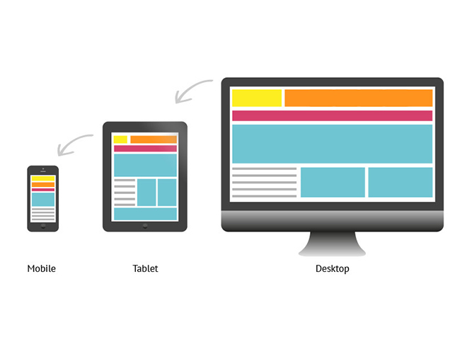
People mostly provide internet access in their daily lives via mobile devices. Mobile devices, which are more comfortable to use, allow users to spend longer time on the Internet. However, websites designed for desktop or laptop computers are especially disturbing in terms of eye comfort when users log in via mobile device, since the screen sizes and resolutions of desktop or laptop computers are not the same. In this case, it causes users to have difficulty reading the contents of the websites they enter on their mobile devices and not to spend time on the site. At this point, website designers have developed a design method called “Responsive Design” to solve this problem.
Responsive design as a word meaning; means responsive, harmonious design. Responsive design is the design of a website to be compatible with every device (tablets, mobile devices, desktop computers, laptops) to which it is accessed. In short, we can call responsive design a mobile-friendly website. While the designed website is adjusted according to the screen sizes and resolutions of the desktop computer, it is also shaped according to the mobile device when logged in via a mobile device. In this way, when users access the site via their mobile devices, they do not have difficulty viewing the visual elements within the site.
When setting up a website, you must first master the concepts of CSS and HTML. A website design consists of HTML codes and is colored with CSS codes. It is necessary to know CSS well, especially for the website you design to be mobile compatible. Separate CSS codes should be used for each resolution. These studies and programming require professionalism. Nowadays, mobile-friendly websites have become a necessity, not a necessity. Working with a web design expert at this stage will move your website forward in every aspect.